A New Era In Horns – Rams 2020 Uniform Review
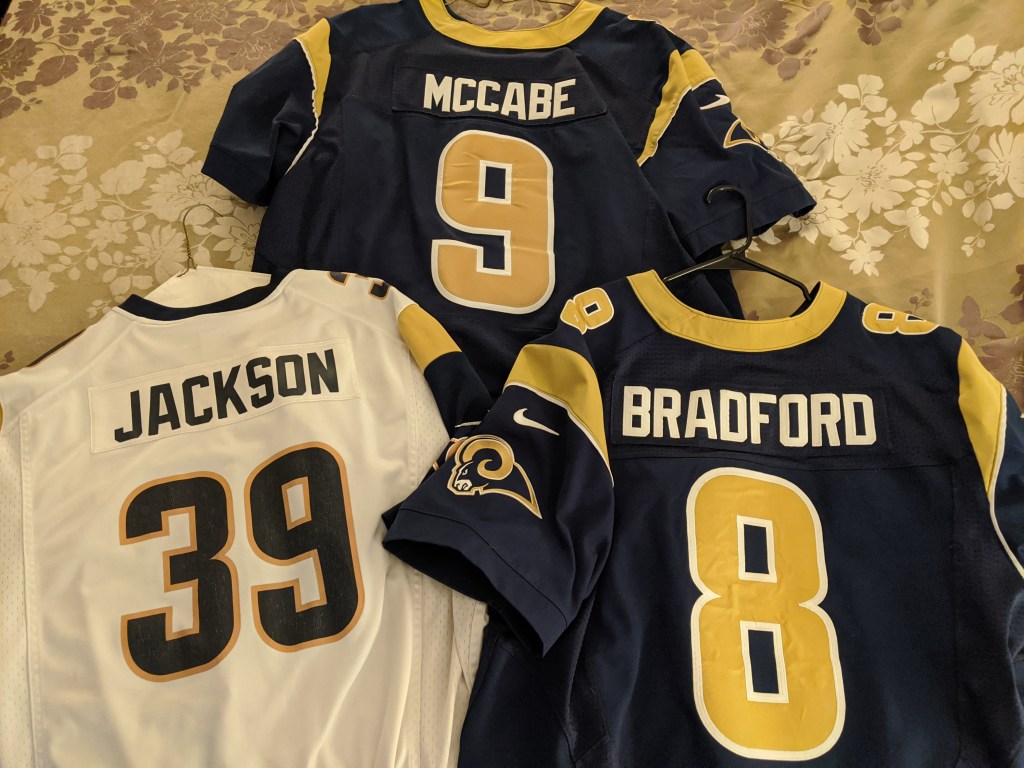
I should probably preface this whole article with a disclaimer that I’m a life-long Rams fan. I’ve been a fan since I can remember; my father and uncle are Rams fans, so I was indoctrinated young. From the uniforms that debuted in the 1970’s that carried through until 1999, the year the Rams won their only Super Bowl title. 2000 brought an update; navy blue, millennium gold and a logo that many at the time said was too reminiscent of the Patriots “Flying Elvis” logo. I’ve owned many Rams jerseys over the years, from a white replica Jerome Bettis jersey I got as an 11 year old (that sadly was stolen from my locker in high school) to my customized authentic jersey in the most recent navy and gold style. Needless to say, I’ve been waiting for today since it was announced 3 years ago that the Rams would be moving to LA and getting a new stadium in 2020.
When the new logo was revealed in March, I was initially as upset as most Rams fans. This logo was panned by the Rams and NFL communities in general and I was right with them. As time wore on, I grew to accept the logo with the caveat “let’s wait and see what they do with the uniforms”. I was of the opinion that the team got the colors right and as long as they didn’t remove the horn from the helmet, I was probably gonna be okay with the new look.
The Helmet – THANK GOD THEY KEPT THE HORNS

Fast forward to today, well, the helmet is mostly right? Colors are spot on and I love the metallic flake they put in the blue, it’s going to look awesome in the California sun in late fall. The horn is still there, but it looks a little off. I’m not sure if it’s the break in the horn or the curve bringing the bottom of the horn so close to the facemask (and overlapped by ugly hardware on some helmet designs I’ve seen), but overall the helmet is great.
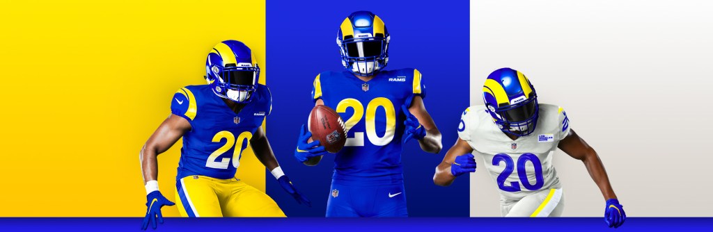
The Royal Blue Uniforms – Classic and Modern?
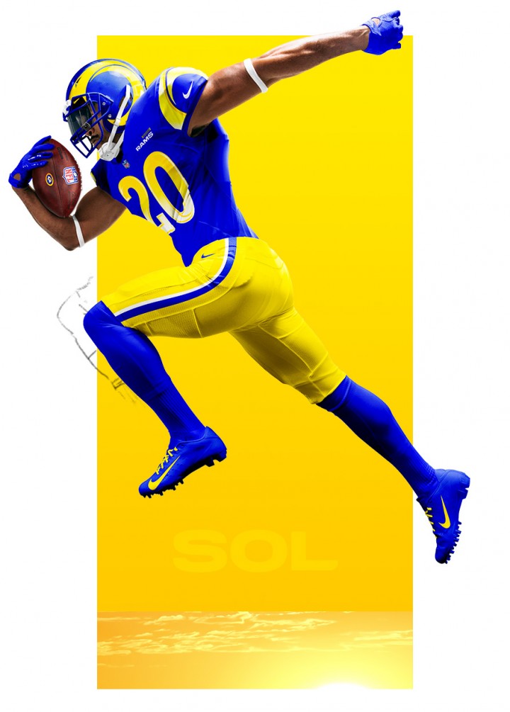
Let’s start with the most traditional of the uniforms unveiled today, Royal Blue over Yellow (or Royal and Sol, if you buy into marketing babble). The first thing you notice is my biggest issue with the uniform set; the font and gradient on the numbers. The renders shown really make that “feature” look like it was done by someone just learning how to Photoshop, but on actual photographs, the numbers do look better. That gradient though, woof. A trend that the NHL experimented with in the 90’s (anyone remember the triangle Penguin uniform?) and quickly went from trendy to dated in the course of about 5 years. This is 25 years later, and the gradient is the “modern” element to the uniform? Maybe it will pop in SoFi Stadium when the Rams finally get there, but on a photo or web page it’s not very flattering. The rest of the jersey is kind of meh, but there is an interesting fact with these royals. The Rams had to appeal to the NFL to remove the TV numbers from the sleeve/shoulder area of the uniform. They are the second team this off-season to forgo the TV numbers on the sleeves (The Patriots uniforms being the first). One more point of note I want to make with the uniform set (as this feature appears on both the royal and bone jerseys), the “logo patch”. This patch just screams testing for future uniform advertisements, such as the kind that appeared in the NBA this season. I hate this trend and I really hope this patch stays a patch and doesn’t turn the Rams into the first NFL team to be a moving billboard.
The yellow pants, however, are perfect. I love the blue with thin white side striping; it looks traditional and unique to the rest of the NFL. It really does bring a throwback vibe to the most traditional of the three uniform sets unveiled today. The next combination keeps the royal jersey, but goes for another “modern” trend, the mono-colored leotard look.
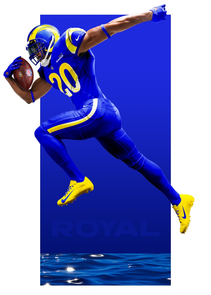
The mono-color look is pretty dominant in the NFL these days. Although I’m not sure which team started the trend, the NFL Color Rush promotion has turned a style you’d generally only see on teams with black as a primary color, and brought it to every team in the NFL. Even the previous uniform set had the mono-yellow “throw-back” style uniform for Color Rush events. I feel like this set up will fill the same role in the current uniform roster. The blue pants are broken up by another gradient, this time on the striping up each leg. Yeah, still not a fan, but as far as a mono-color uniform goes, this isn’t too bad (even if it’s not even close to this!). I’m not sure there is anything specifically wrong with this combination, but compared to the blue/yellow this is a dud.
Off-White or Bone, either way it’s unique!

Now we get to the final of the three revealed uniforms for the 2020 Rams, and it’s far and away the biggest departure from both the previous set and anything we’ve seen in the NFL to date. Generally, teams have a team colored uniform they wear at home and a white uniform that is worn on the road (for most teams, yes I know Cowboys fans). As far as I can tell, this has been a thing since the NFL’s inception and was even written into the uniform rules, until now. The Rams had to once again apply for special permission to use a color other than white for the “white designated” uniform slot. I’m honestly glad they did. I’m a big fan of cream colored home uniforms in MLB (looking at you Cardinals), but that color doesn’t really work for the NFL. The grey uniforms used by the Seahawks are used similarly and don’t look bad, but these off-white (or Bone – again with the marketing babble) uniforms have really grown on me as I continue to look at the set. For one, no gradient! The blue numbers really pop off the “bone” uniform and I’m glad the team didn’t make some sort of corny blue/yellow or blue/white gradient on these numbers as well. This uniform does have a bit of that leotard look, but I’m guessing they’ll be able to be paired with the blue or yellow pants as well, so we could have some pretty interesting combinations for the future out of this uniform. I’ll be curious to see if this sticks, or we see it replaced with a standard white set in the near future. This happened with the Arizona Diamondbacks in MLB; they tried to go with a much darker than standard gray for their road uniforms. After much backlash from the fans, it was altered back to a more standard gray for the upcoming season; a net loss in my eyes.
Overall, I’d say this uniform change is a push. I personally loved the old logo and would have liked seeing it translated to the new color scheme. The Rams went back to the right colors and made some bold and interesting choices (gradient bad, bone good), but the missteps leave me wanting more out of the set. While I will still likely end up owning more than one of these if the past is any indication; I feel like we may be looking forward in 5-6 years to another redesign, as this one doesn’t have that “timeless” feel a good football uniform should have.
Stay Safe!
- Patrick
Categories

Great article about the jersey’s – I love the bone colored ones also even if I am not a die hard Rams fan… Good luck this season
LikeLike